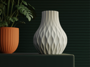
In a world filled with visual noise, negative space has quietly become one of the most powerful tools in a designer’s toolkit. Often called “white space,” it’s not just empty — it’s intentional. When used effectively, negative space can elevate a design from cluttered to compelling.

What Is Negative Space?
Negative space refers to the empty or blank areas between design elements — the breathing room around text, images, and shapes. It gives structure to a layout, allowing key elements to stand out and guide the viewer’s attention naturally.
Think of Apple’s product pages or Google’s minimalist interfaces. The spacious layouts are not accidental; they’re crafted to create focus, comfort, and elegance.
Why It Matters
- Enhances Readability: White space between lines and paragraphs improves text legibility and makes long reads easier on the eyes.
- Creates Balance: It helps establish hierarchy, ensuring no element overpowers another.
- Invokes Emotion: Minimalism often conveys sophistication and confidence — the “less is more” philosophy at work.
Tips for Using Negative Space
- Start with structure: Use grids to define consistent spacing.
- Simplify your palette: The fewer distractions, the more impact your negative space has.
- Let content breathe: Resist the urge to fill every corner — empty space can speak volumes.
Final Thoughts
Negative space isn’t wasted space — it’s a design element in itself. Whether you’re crafting a brand identity, a website, or an app interface, remember: the silence between the notes makes the music.


